WORK / Print
Coffee Supreme
Packaging
Sixteen different take-away coffee cup designs, each with their own hand-drawn variation of the Coffee Supreme logo, adds a light-hearted personal touch to their customers' daily routine of buying a coffee.
Sixteen different take-away coffee cup designs, each with their own hand-drawn variation of the Coffee Supreme logo, adds a light-hearted personal touch to their customers' daily routine of buying a coffee.
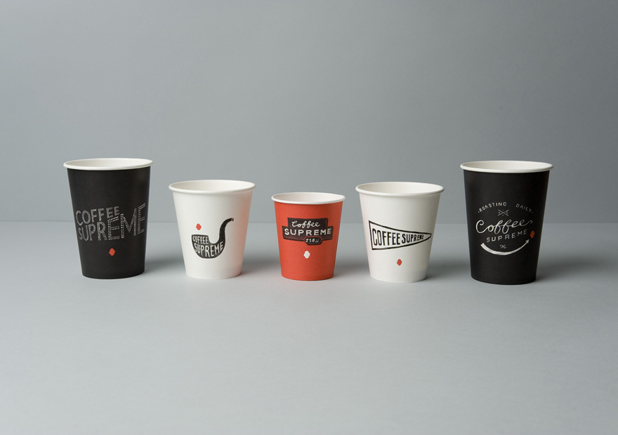
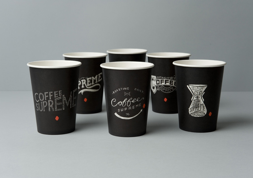
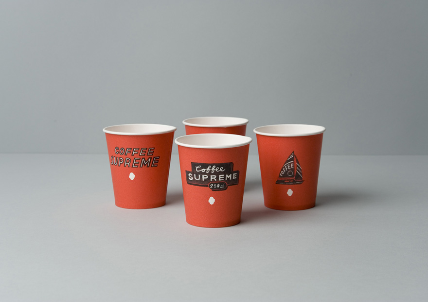
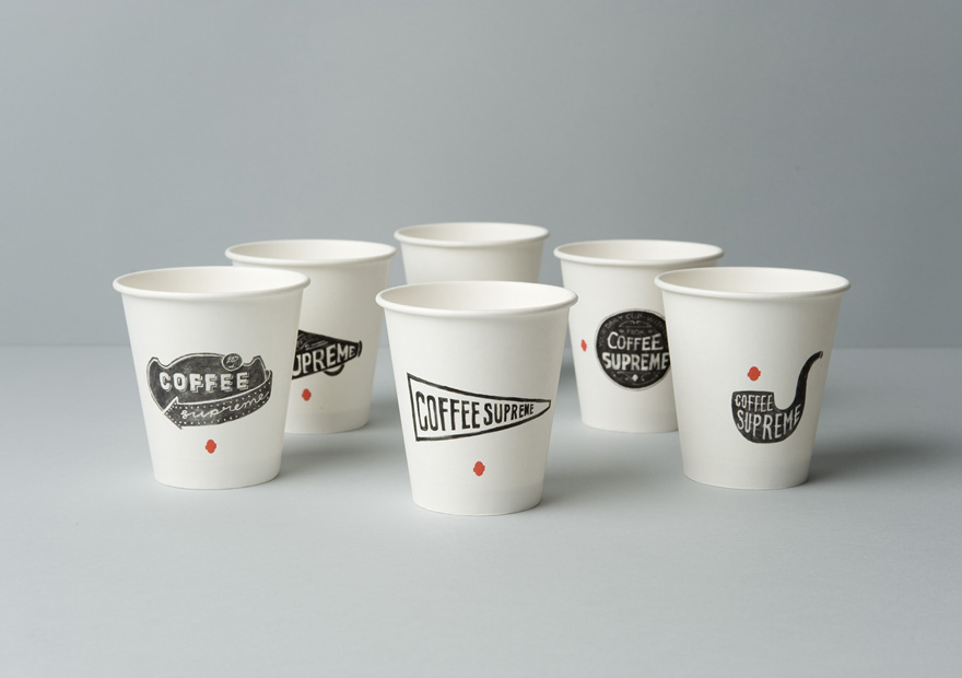
Part of our full rebrand of Coffee Supreme was design of their take-out cups. To communicate some of the company's quirkiness & character as well as the hand-crafted nature of their business, the designs reference old hand-made signage, including 1800s packaging labels and sign-writing, 1930s movie titles and early neon.
There are 16 in total, each with a different illustration lovingly hand-drawn by Team Hardhat in paint, ink, chalk and pencil. The cups come in three different colours from the brand palette, allowing them to be easily distinguished by cafe staff.
illustration
packaging design
print management
Coffee Supreme - Identity
All Good - Web Development
Best Design Awards Win for Coffee Supreme Packaging - Best Design Awards
Best Design Awards Win for Coffee Supreme Identity - Awards
1st place win at the Dieline Packaging Awards - Award